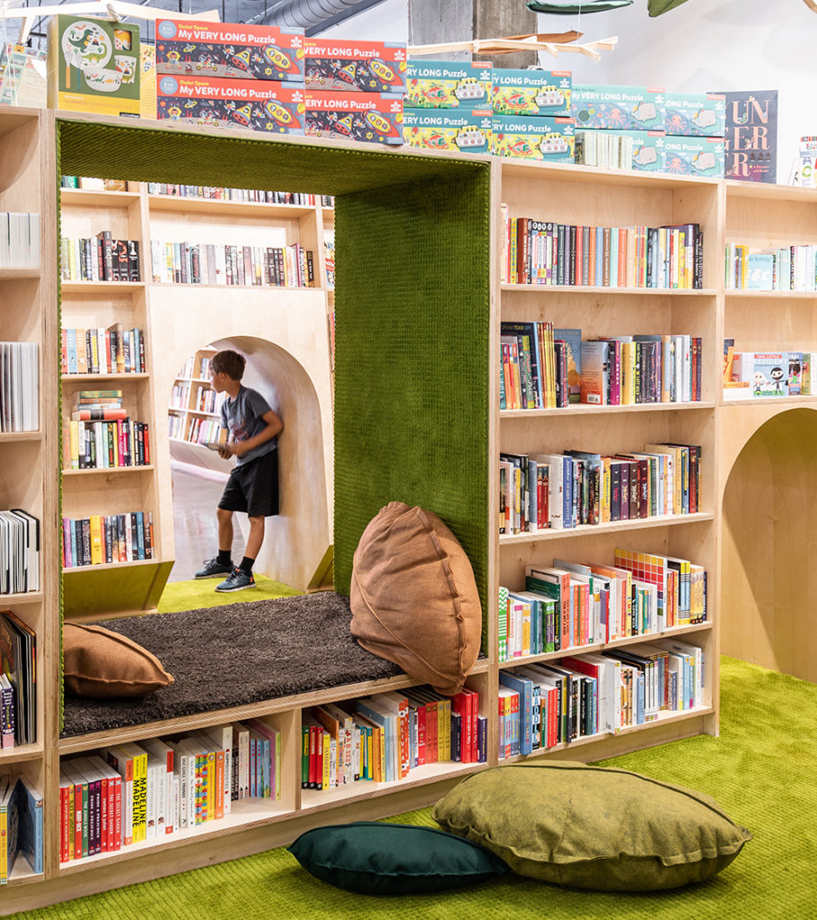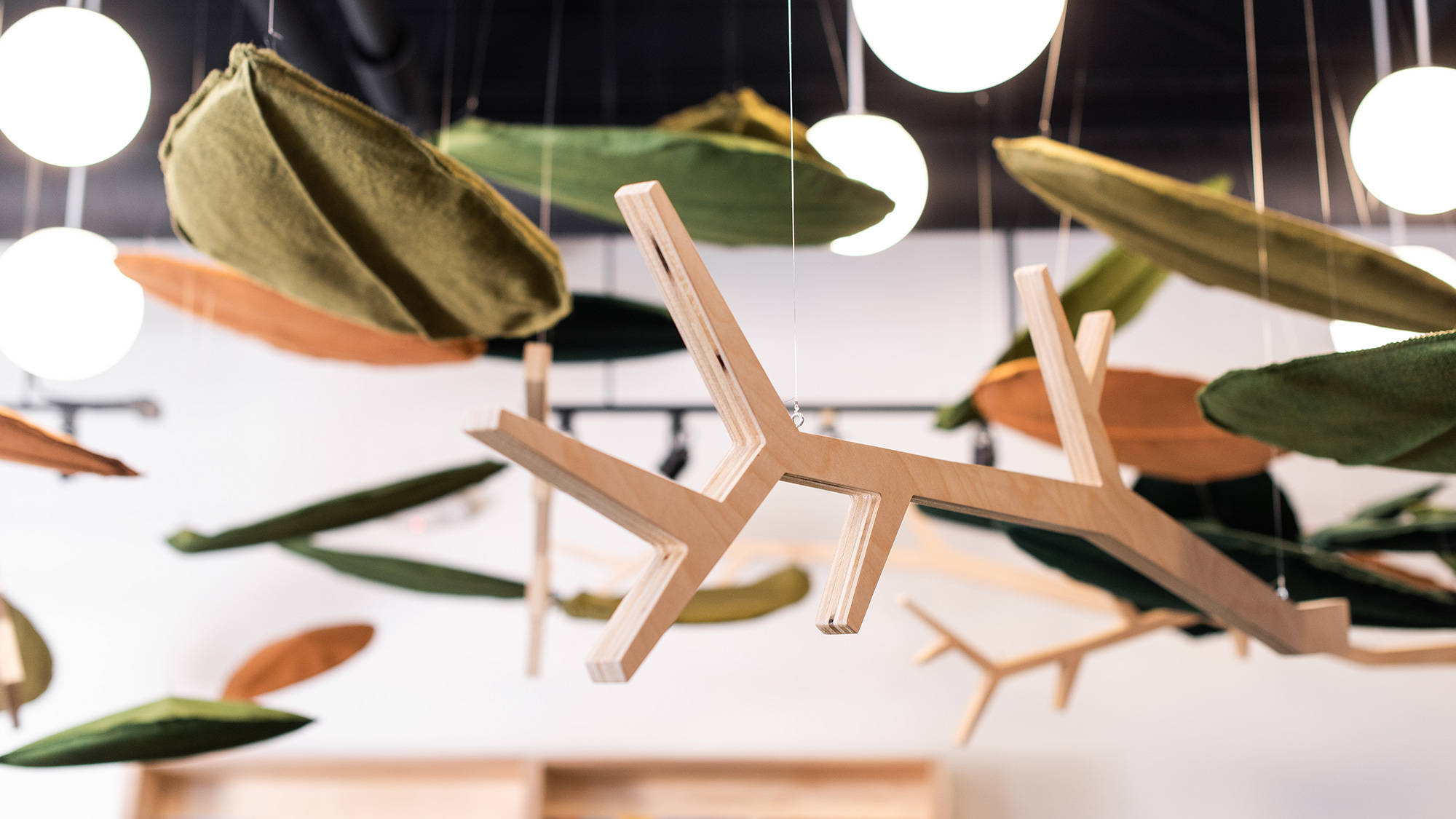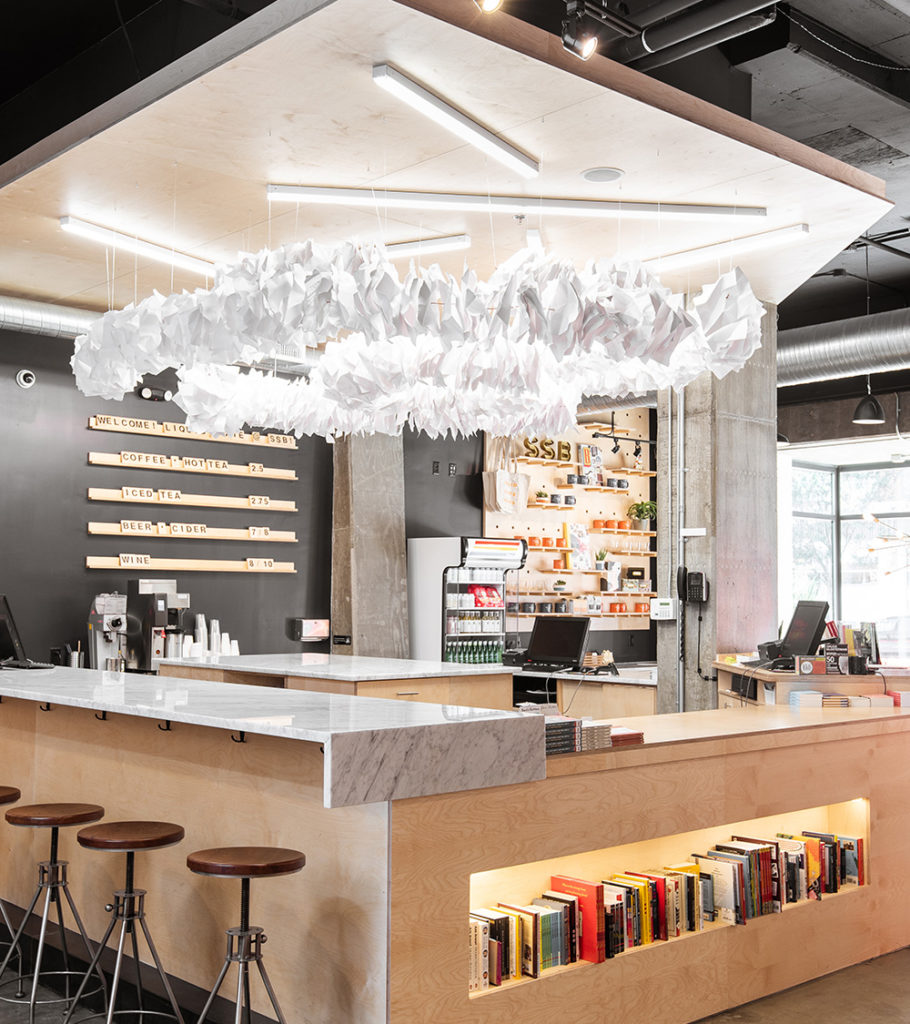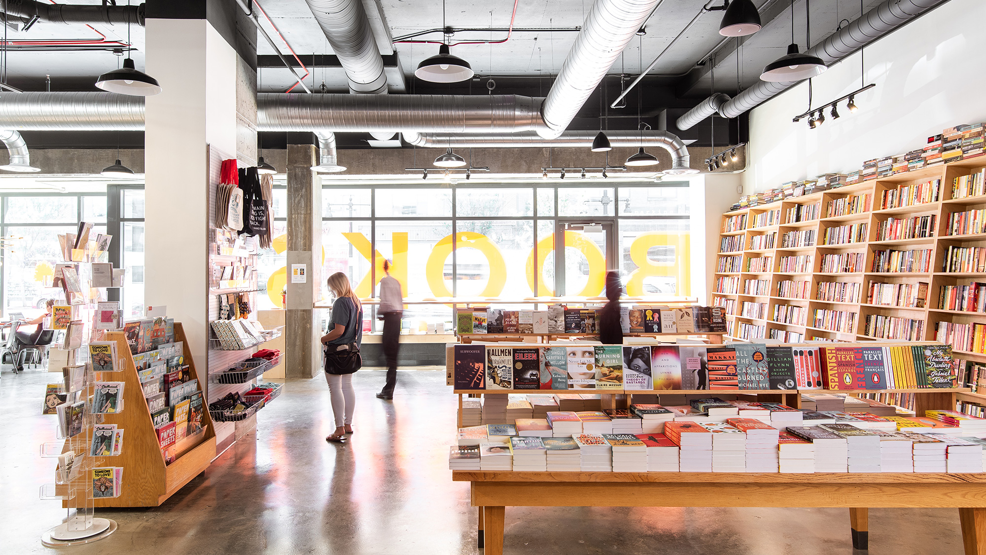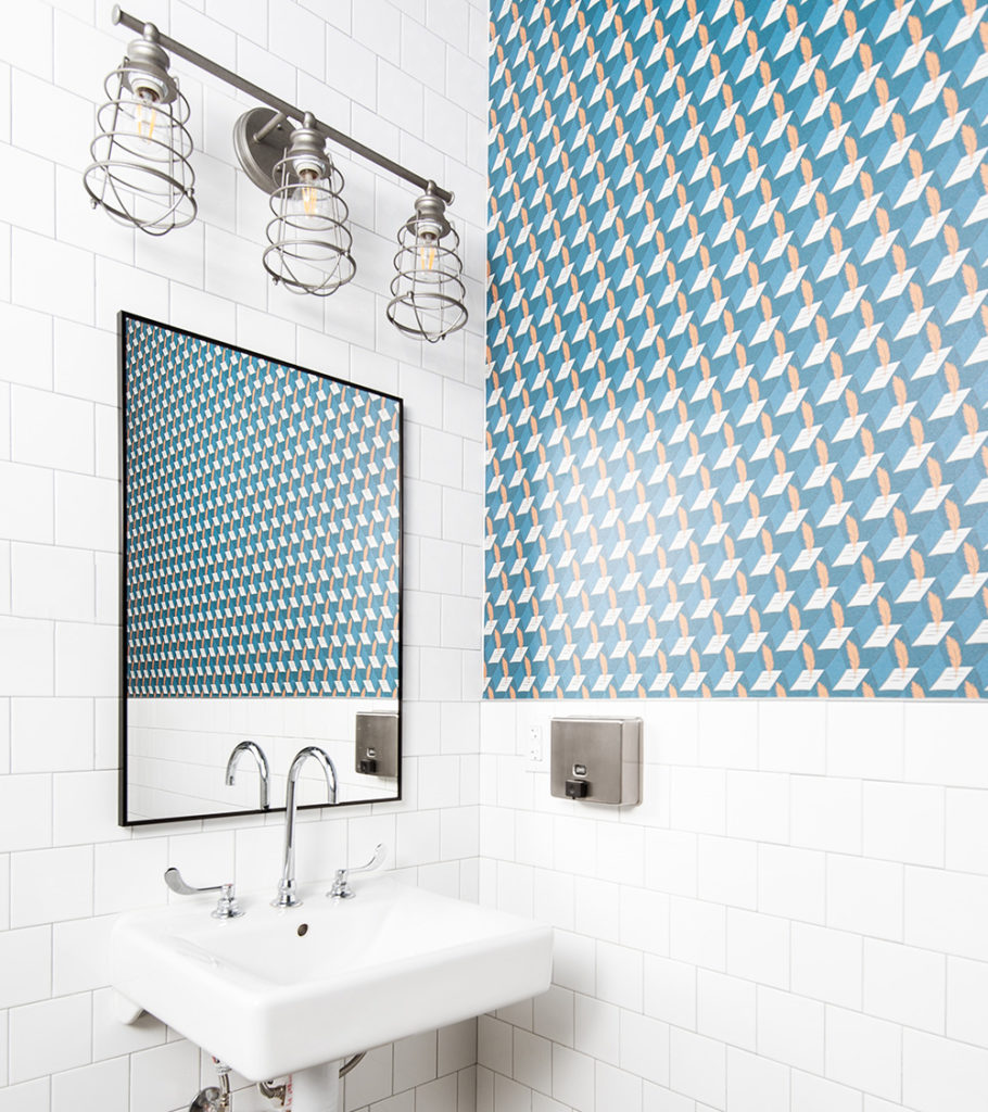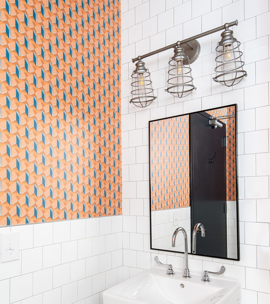
We came onto the project alongside the architect, working in tandem from the start. This type of early collaboration allowed us to look at the space as a whole to determine how branded moments were woven into the architecture. From there we established three key areas for interaction and brand alignment: the children’s section, the point-of-sale and the exterior facade.
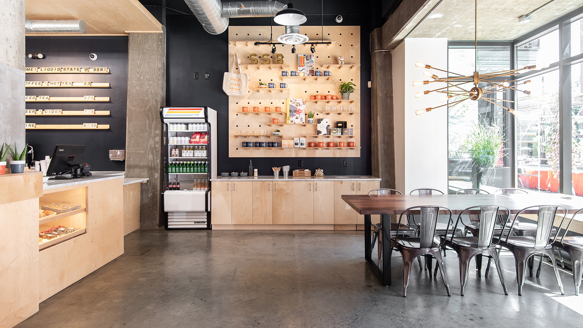
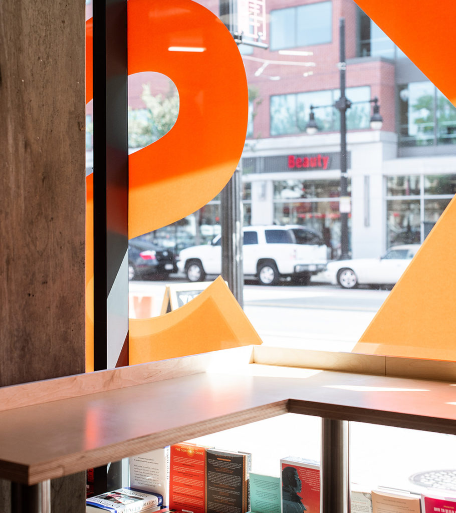
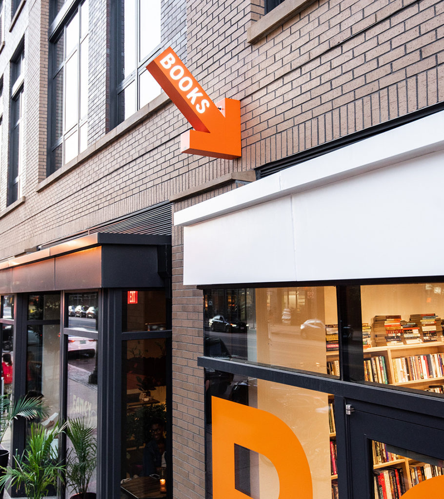
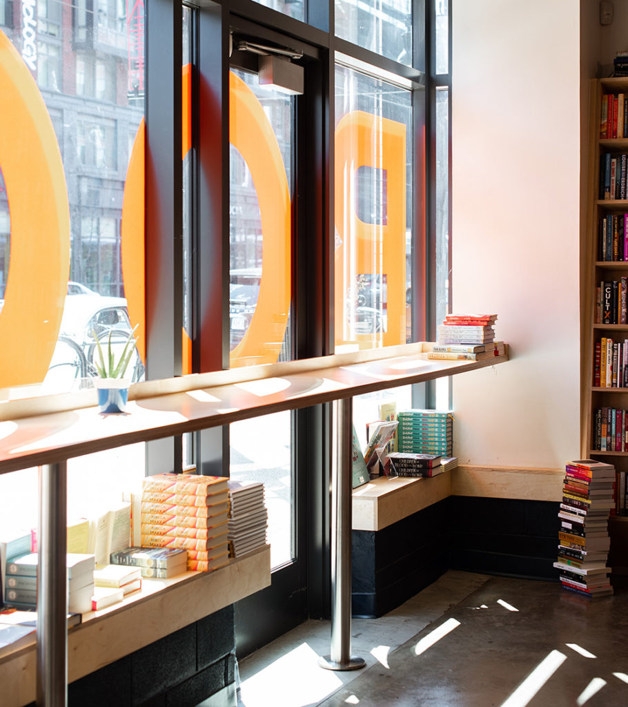
The children’s section became the focal point where kids and parents interact with books together. We designed a tree with hand-sewn leaves hanging from above to enclose the environment. The point-of-sale is where many imaginative visual elements come together—from the built-in shelves to the exploded book art and light feature and custom peg board display, all of our carefully curated ideas were woven together. On the exterior facade we developed a playful and brightly colored system of sign elements—from the orange arrow to the oversized bold typography, the graphic system of elements aligned with the curated products and mission of the brand.
The store has been featured in Washingtonian, Washington Post, and Brightest Young Things.
Programming / Experiential Graphic Design / Fabrication Planning / Sign Location Plan / Permitting / Art Consulting
