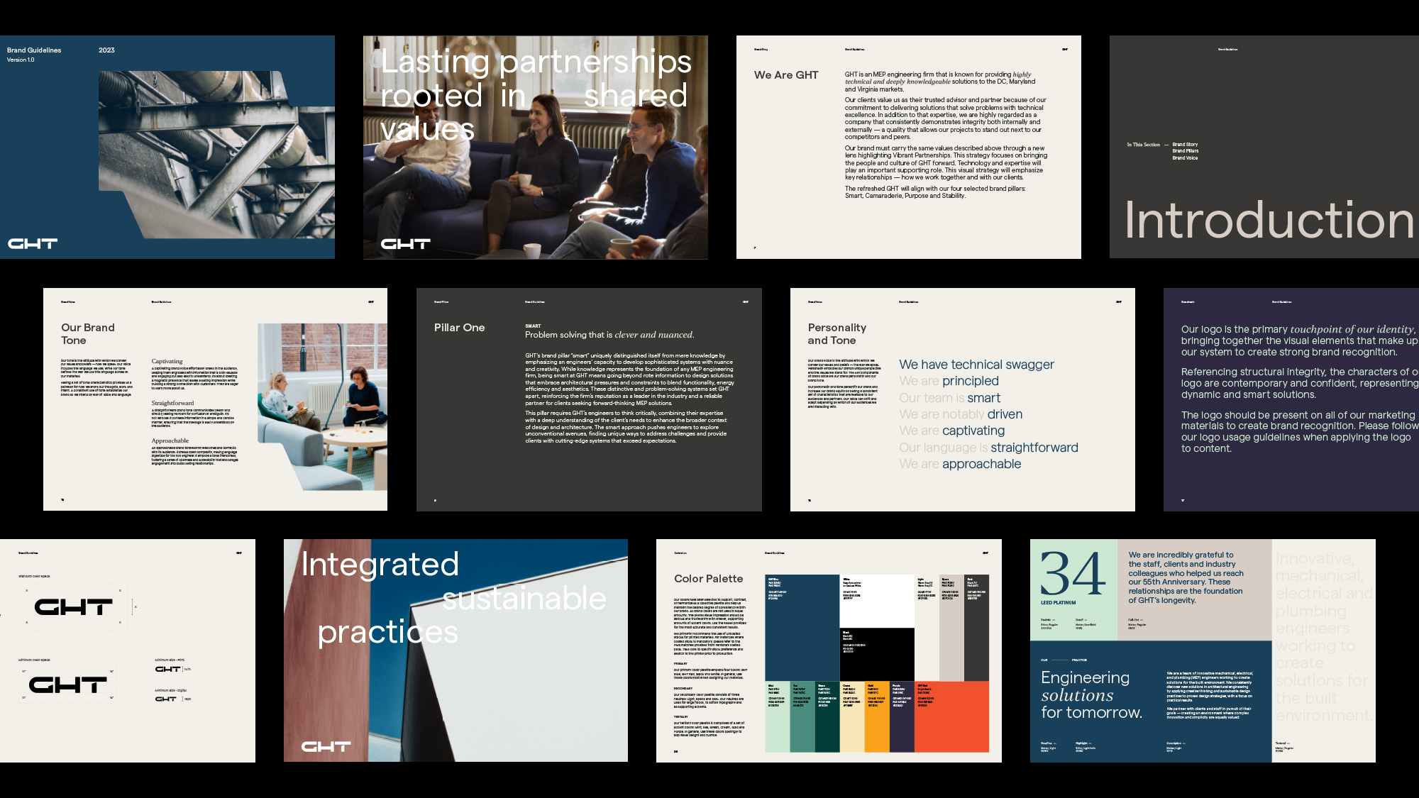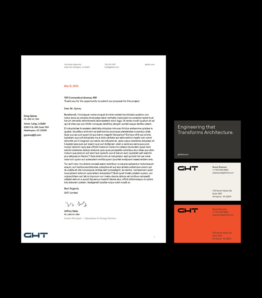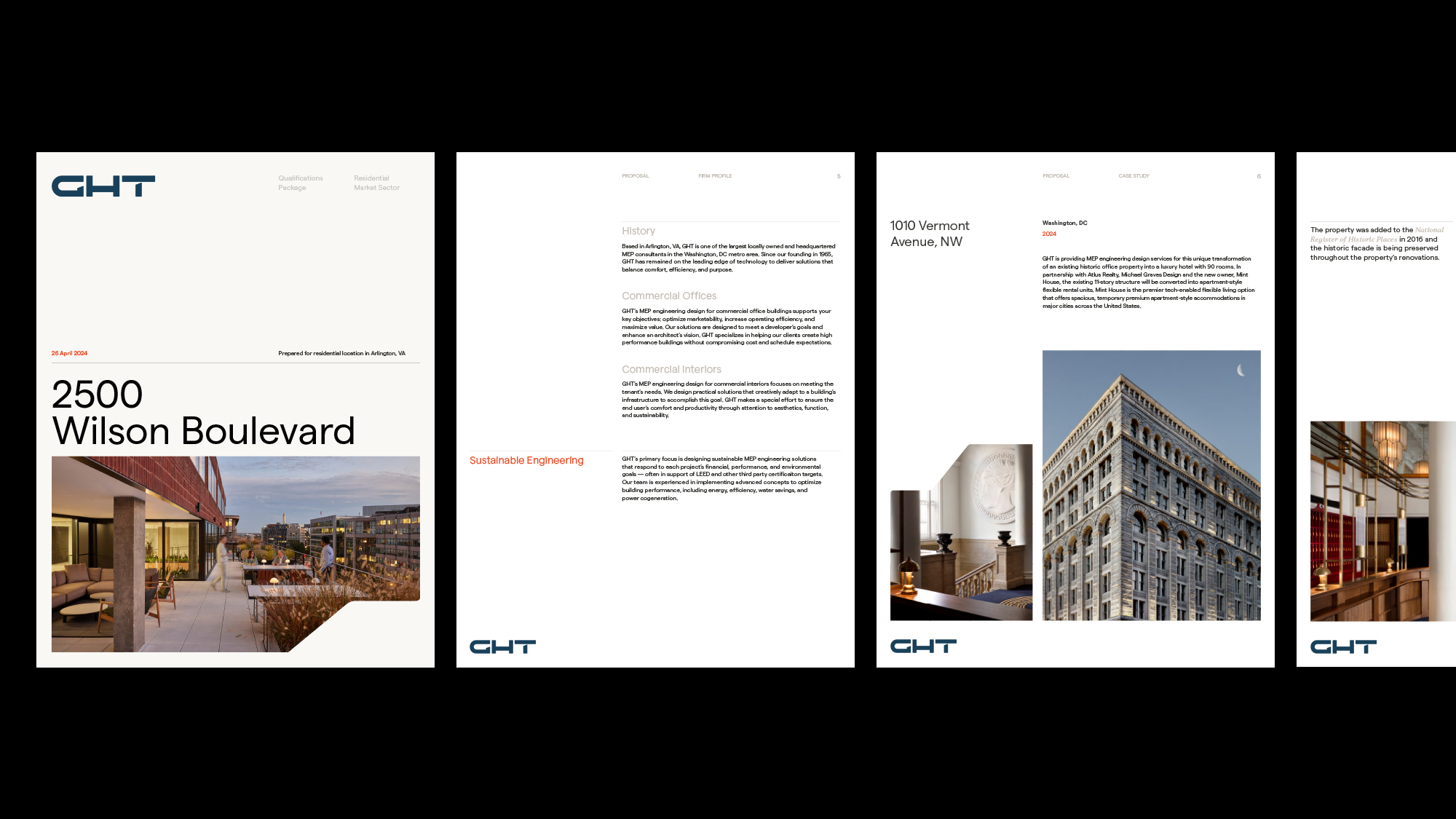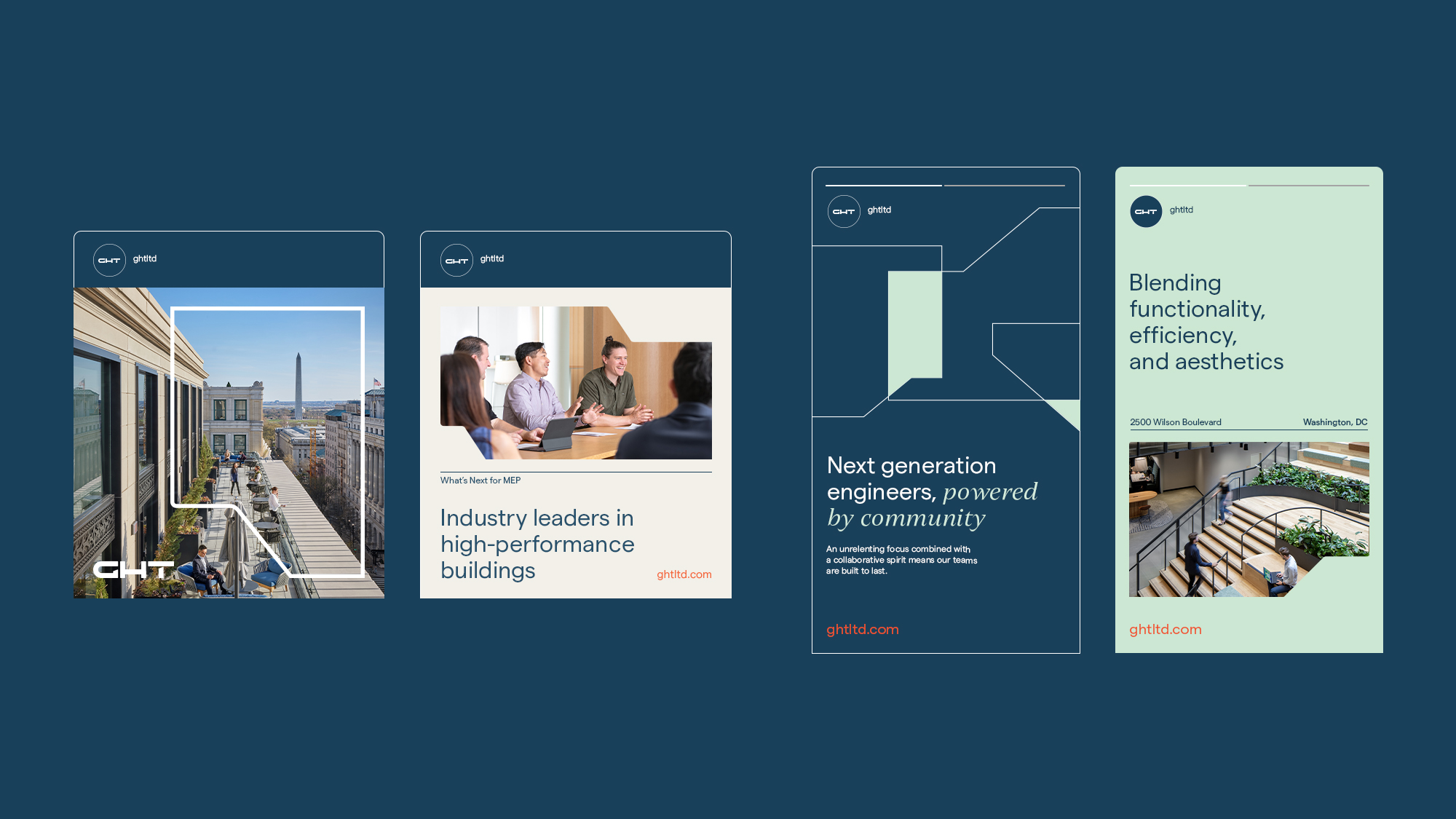
Our expertise in branding for the built environment informed our approach. The visual strategy, built after conducting internal and external interviews, focused on Vibrant Partnerships. This theme highlights the people and culture that make GHT exceptional. While technology and expertise remain crucial, the new visual strategy places significant emphasis on the relationships GHT cultivates — both internally among the team and externally with clients. This approach not only emphasizes GHT’s collaborative spirit but also showcases the dynamic interactions that drive successful project outcomes.
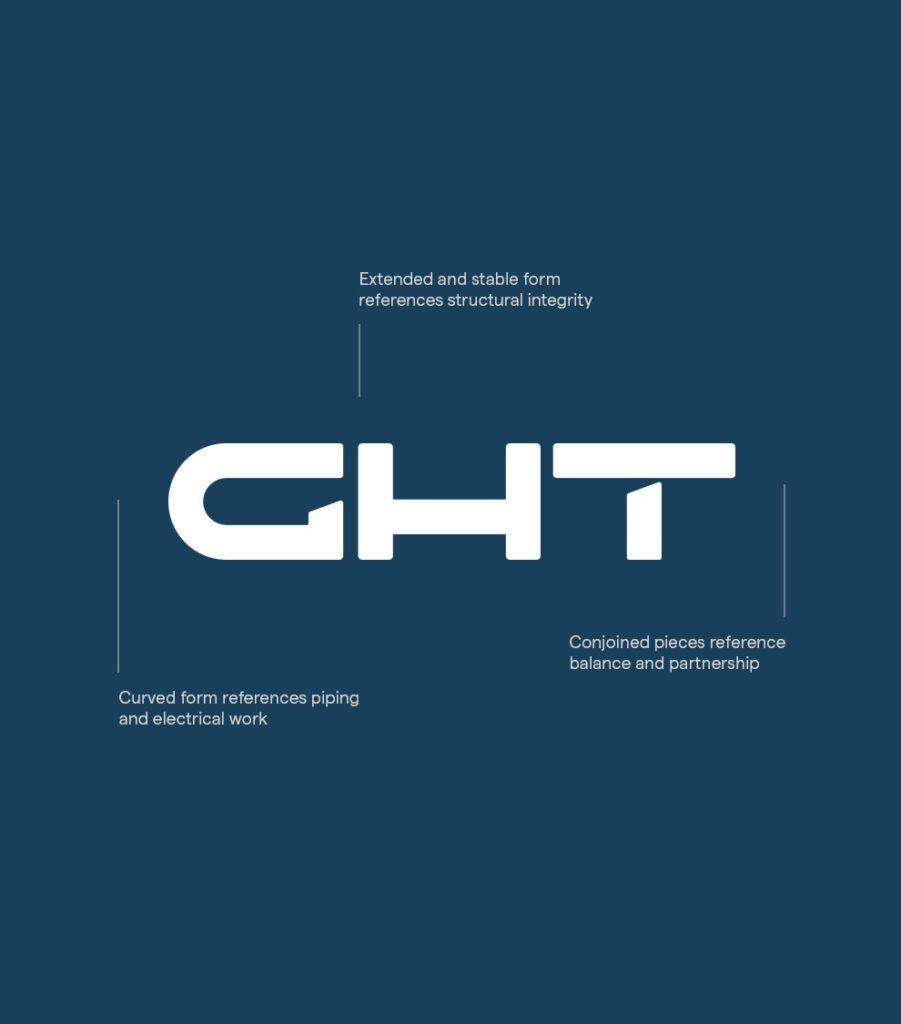
The logo references structural integrity. Each character of the logo is contemporary and confident, representing dynamic and smart solutions. The new color palette is vibrant and fresh, while giving an overall visual impression that is serious and trustworthy by using smaller, supporting amounts of accent colors. From there, we expanded the brand into the collateral suite and a robust proposal and presentation system templated for use by internal marketing teams.
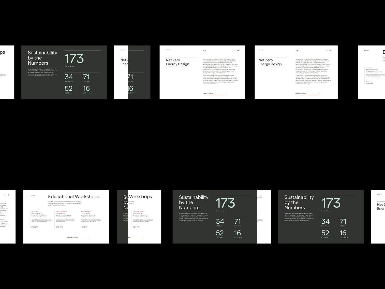
The final part of our initial work together was the website redesign. Dynamic elements from the brand system, including complementary type treatments and bold shapes, were brought to life online through a system that highlighted technical swagger and people equally. The website is an embodiment of the brand’s personality and includes an art-directed photoshoot and copy crafted internally by the Spaeth Hill team.
Brand Visioning / Stakeholder Interviews / Brand Pillars / Logo + Brand Guidelines / Photography Art Direction / Copywriting / Marketing + Collateral Design Services / Website Design


