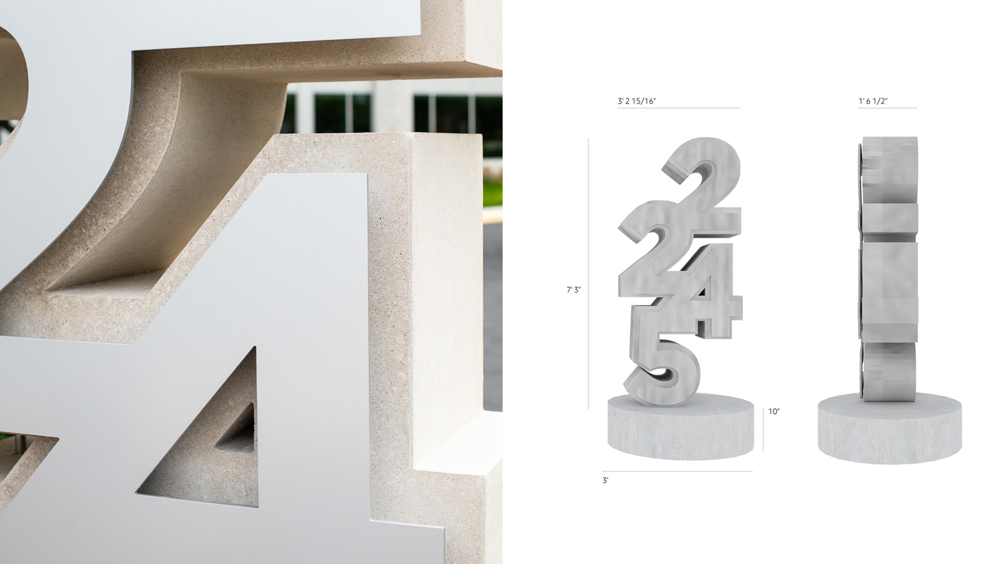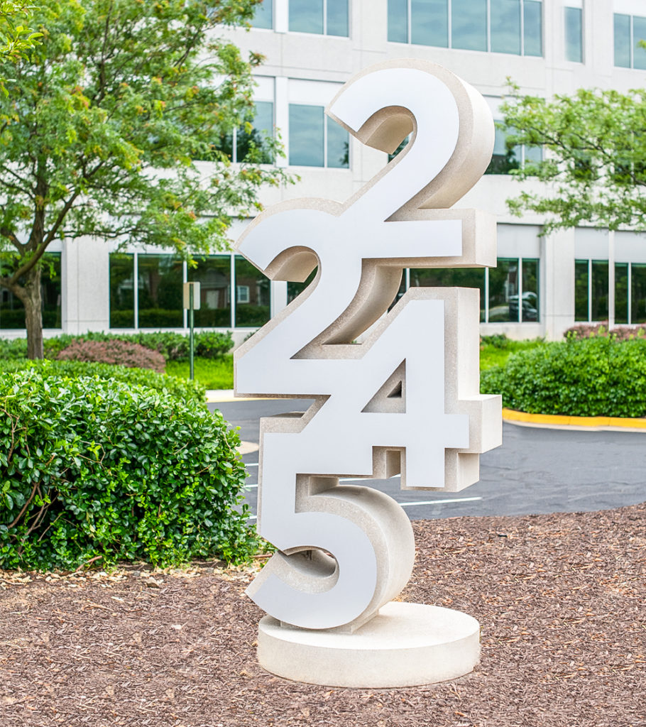
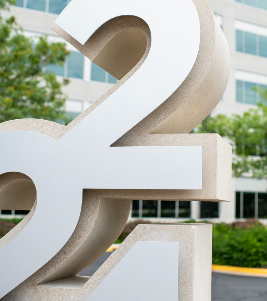
Because this sign did not have a Comprehensive Sign Plan governing size and location, we first determined an appropriate mass based on the Fairfax County signage ordinance. Knowing we’d gain more visibility with height over width, we decided to playfully stack the numerals using a sans serif type treatment for legibility as well as stability. Once the shape was refined, we explored materials that felt complementary to architectural elements of both office buildings. We worked closely with Arban Precast Stone, a family run business with roots manufacturing stone in Italy and Germany since the early 1900’s. Together, we fine-tuned the cast, stone and overall structure. We added an aluminum panel on top of the precast stone to not only add another textural element, but as a house to enclose the illuminated element of the structure.
Wayfinding / Signage Design / Location Planning / Construction Documentation / Construction Administration